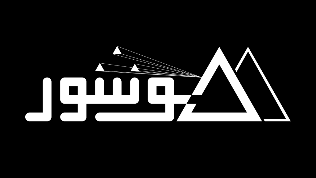
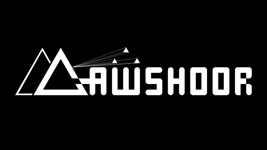
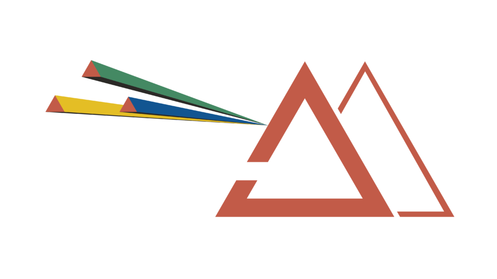
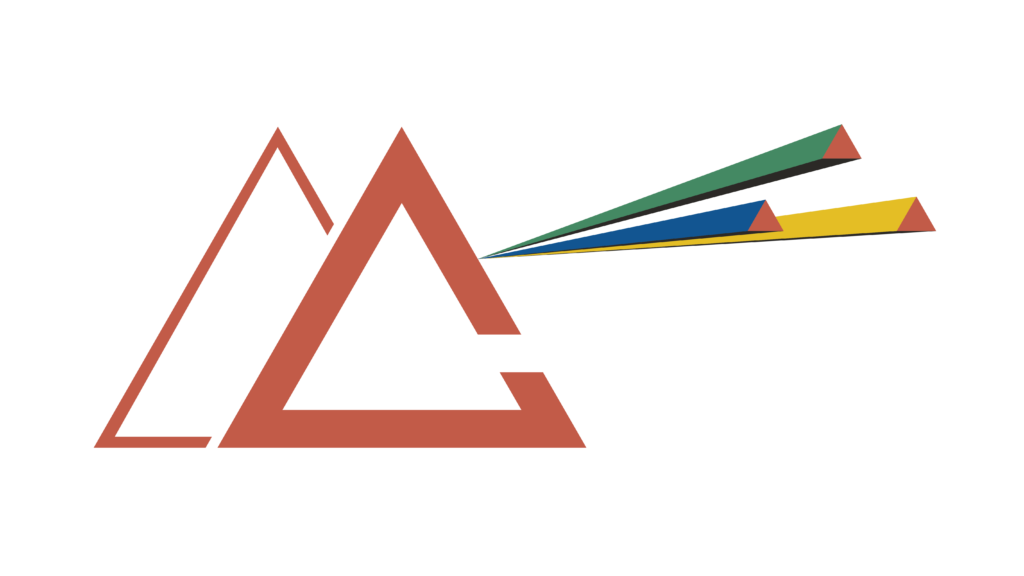
“Shou3a3” designed the logo and visual identity (Arabic and Latin) for Moushour magazine, published by the Observatory of Food Sovereignty and Environment, drawing on the prism as a symbol of multiple perspectives and interpretations. A dual logo was developed to maintain visual coherence across both writing systems, using clear and contemporary typography that reflects the seriousness and openness of the content. The color palette was inspired by the Global South, featuring earthy tones, greens, and warm hues associated with land, agriculture, and nature—creating a cohesive identity that embodies the magazine’s positioning and core issues.